Special Issue - Science communication: Making research accessible - Knowledge visualisation in science communication: Personal insights from an MSCA Postdoctoral Fellow in social sciences
“A picture is worth a thousand words,” as the saying goes. Yet creating a picture that achieves this requires just as much thought, skill, and dedication as writing an impactful thousand words about your research. Still, in many national academic accreditation systems, it counts for nothing. A personal reflection with practical tips on visual science communication from a former MSCA fellow – and a plea that it truly is worth it.
Loosening the imagination
When preparing my MSCA Postdoctoral Fellowship (PF) proposal, I paused when I read that Horizon Europe not only encourages science communication but makes it a contractual obligation. That night, I was brave and rewrote the third objective of my research proposal with research objective 3 (RO3) applied, i.e. increasing the impact of social science and humanities through visual (digital) science communication.
My inclination towards visualisation predates my academic trajectory, but it was certainly brave to combine research on policing and EU security with creating digital images. My proposal was successful. Through the fellowship, I could legitimately invest time in visual work, coupled with opportunities to train new skills. I was a newbie in science communication, digital visualisation, and quantitative data visualisation. The MCAA blogging workshop held in 2023 was my first introduction to the science communication challenge of defining one’s audience and message. After a day-long online training, preparation and peer-review, my first- ever blog post emerged: a comic strip and short text launching my study.
Two years later: some of the lessons learnt
Many image types, often integrating visuals and words, are used to convey scientific complexities through visual communication. Visuals are also increasingly employed to capture responses when scrolling online: for readers to stop, view, read, remember – and, if you are lucky, jackpot: they follow a link to your work. Importantly, visualisations are powerful tools in visual thinking, note-taking, data analysis, academic articles, posters, presentations, and reports.
Visual literacy: The ability to create and make sense of visuals. You may be used to reading charts, don’t underestimate your visual literacy. I struggle to make sense of certain chart types myself. Keep it simple, especially when your target audience is less familiar with data visualisation, and integrate words effectively. Why? Because you want your audience to engage with the story. For many purposes, the more accessible and immediate, the better.
What chart, infographic, or other multimedia output suits what type of data or story? The linked guidelines are a great way to start! However, visual storytelling isn’t merely, nor necessarily, numerical data visualisation – it’s about finding a visual metaphor and, most of all, telling a research-based story that connects with your audience.
Clarity and accessibility: Content, form, but also colours! Clarity in visual terms also means using a few colours per image and maintaining a consistent palette across visuals. Empty space isn't a waste. Did you know that not everybody sees colours the same way? When we use colour to create contrast, for example, to differentiate between visual or data elements, or text and background, we need to make sure that the contrast is visible to everyone. Some colours that you can distinguish may appear identical to others, or vice versa, due to colour vision deficiencies. Inclusivity matters: contrast-check!
Free DIY resources: For data visualisation, Flourish, Datawrapper, and Rawgraph have free versions. To work collectively on a specific output, Canva is a great tool that provides templates and icons. Additionally, check out CC0 image repositories, for example, Icon Library or Arcadia for life sciences.
Visual communication is a vibrant community, especially in STEM. My favourite tip: pick up a pen and draw your own visual vocabulary! Besides costly professional software, free programmes suffice to draw or compose digitally, or to finalise scanned analogue illustrations. My two visuals shared here were drawn on paper, scanned, and coloured in Paint.NET. Finally, something I learnt the hard way: always check what image resolution and format the publishing portal requires to ensure the output is sharp and not fuzzy or stretched.
Professional support and collaborations: You may have little interest in DIY or engaging in more complex visual communication, such as scrollytelling or animation. More elaborate visual storytelling requires specific professional know-how, time, and financial resources. Reach out to professionals – perhaps even at your university.
Hind and foresight
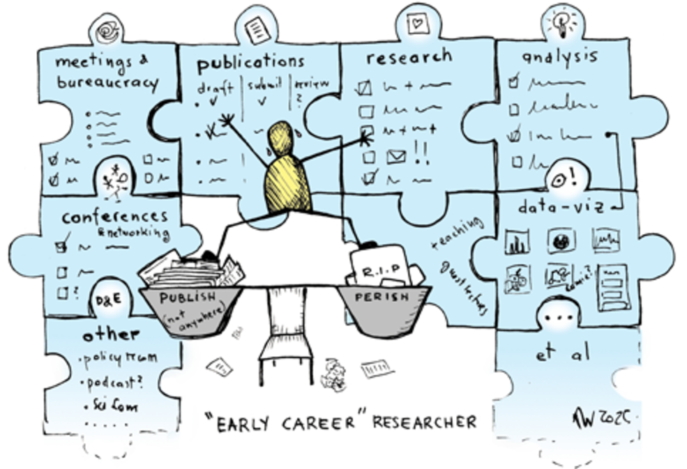
During my fellowship, I worked on multiple visualisations, several of which are still to be finalised or published. Not everything was doable within the fellowship period, or with my DIY skill level. But I am proud of what I managed. I also met specialised professionals, thanks to the MSCA secondment and training, and I saw others’ results of collaborations. Importantly, I met many colleagues with amazing research projects and publicly relevant knowledge beyond their specialist focus. Yet science communication often isn’t part of their job. Visual communication often remains beyond imagination or financial reach. Such skills are rarely part of academic training, nor is the output typically recognised as academic labour.
Monika Weissensteiner
University of Trento, Italy